Charts Collection (Part 2) Presentation preview
Title Slide preview
Revenue Projection Slide preview
Quarterly Revenue Slide preview
Profit Margin By Product Slide preview
Regional Revenue Growth Slide preview
Monthly Revenue Slide preview
Year-To-Year Comparison Slide preview
Project Progress Slide preview
Quarterly Sales Slide preview
Development phase Slide preview
Development Phases Slide preview
Marketing Channels Slide preview
Waterfall Chart Slide preview
Team Performance Slide preview
Six-Month Progress Slide preview
Twelve-Month Progress Slide preview
Total Revenue Slide preview
Revenue Projection Slide preview
Monthly Numbers Slide preview
Competitive Analysis Slide preview
Key Metrics Slide preview
key performance Slide preview
Competitive Analysis Slide preview
Performance By Department Slide preview
User Feedback Slide preview
Customer Distrubtion Slide preview
Revenue Split Slide preview
Revenue Generation Slide preview
Product Comparison Slide preview
TREE MAP Slide preview
Product Comparison Slide preview
Option Comparison Slide preview
chevron_right
chevron_left
download Download this presentation

Get 8 out of 35 slides

Powerpoint Keynote
View all formats chevron_right

Download and customize this and hundreds of business presentation templates for free

Start for free ⬇️

Voila! You can now download this presentation

Download

Preview

View all chevron_right

Synopsis

As we visualize data, it helps spark new ideas. But over 63% of time spent developing visual presentations is wasted just to design graphs and finalize their layouts. Save your most precious resource with our Charts Collection (Part 2), which includes pre-designed charts, graphs, data maps, and visualizations that are easy to use, fully customizable, and ready to tell your story.

stars icon
Questions and answers
info icon

Some future trends in the field of data visualization and presentation could include the increased use of AI and machine learning to automate the creation of visualizations, the development of more interactive and immersive visualizations through technologies like VR and AR, and the rise of data storytelling where data is presented in a narrative format to make it more engaging and understandable. There might also be a greater emphasis on real-time data visualization as the demand for up-to-the-minute information grows.

The use of pre-designed charts and graphs can significantly influence the audience's perception of the presented data. They provide a visual representation of data, making it easier for the audience to understand complex information. They can highlight trends, patterns, and outliers, making the data more digestible. Moreover, well-designed charts and graphs can enhance the credibility of the presentation, as they show a level of professionalism and attention to detail. However, it's important to choose the right type of chart or graph that accurately represents the data, to avoid misleading the audience.

View all questions
stars icon Ask follow up
download Download this presentation

Get 8 out of 35 slides

Powerpoint Keynote
View all formats chevron_right

Download and customize this and hundreds of business presentation templates for free

Start for free ⬇️

Voila! You can now download this presentation

Download

Slide highlights

Use this Regional Revenue Growth chart to break down revenue goals by locations or markets across multiple years. Chart revenues across existing products, those in development, and those not yet developed.

Regional Revenue Growth

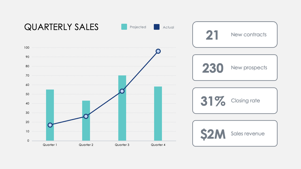
Highlight milestones with this Monthly Numbers chart. Track metrics across quarters and add optional quarterly goals to visualize how a focus on certain activities influences your revenue data.

Monthly Numbers

Compare strengths and weaknesses between product features with this Product Comparison chart. Visualize data from customer surveys and overlay two or three products to weigh them against each other.

Product Comparison

Outcome

Our brains process visual information 60,000 times faster than text. The average meeting length shrank to 30 minutes or less in 2020. Quick-to-the-point data visualization is more important than ever to communicate ideas efficiently.

Better data visualization also helps the story of your business more engaging and persuasive. This helps your team to understand and identify trends faster, empowers quick decisions in response to patterns, capitalize on successes, or reinvent yourself fast to improve or change course.

Competitive Analysis

Application

Here are a few suggested uses for the Charts as part of this collection. As always, you can customize these uses and tailor these slides in any way to present your own numbers.

  • Competitive analysis: compare your company's revenue, new subscribers and average customers to your competition. Visualizes the competitive landscape and analyze your rival's gross revenue by quarter to your own.
  • Department and product advantages: Correlate department success across key activities and measure contributions to its overall success. Contrast product advantages with simple visual analysis.
  • User feedback: Survey users and visualize key discoveries to learn how your customers perceive your products and services.
  • Customer distribution: Discover customer demographics with sales data to visualize your key markets.
  • Revenue: Track revenue across new accounts, projects, or partnerships. Track margins across products and compare revenues across years to discover the most significant growth increases and revenue drops.
  • Treemap: Compare relationships between business ventures in a branched hierarchy and visualize ratios by scale.
  • Option Comparison: Weigh potential business moves and the cost of those actions to optimize how you make decisions.
TREE MAP
Option Comparison

Implementation

When you present data, you tell a story. According to Stanford professor Jennifer L. Aaker, stories are most optimal when they are memorable, impactful, and personal.

Introduce your company to an audience. Summarize a more in-depth report for your team. Provide critical data for your managers to act on. Share new possibilities for product development. Share growth potential and long-term vision with prospective investors. Tell the story that will shape your company's future.

stars icon Ask follow up

For more resources to save you time, check out our Charts Collection (Part 1), as well as our Ultimate Charts (Part 1) and Ultimate Charts (Part 2)

download Download this presentation

Get 8 out of 35 slides

Powerpoint Keynote
View all formats chevron_right

Download and customize this and hundreds of business presentation templates for free

Start for free ⬇️

Voila! You can now download this presentation

Download